ABSTRACTION
What is abstraction?
Abstraction is a form of art and photography which focuses on: shapes, colour, form, pattern and texture. Many abstract images have no instant meaning however when you look into the image, these concepts will sort of shape up the image and suggest to the viewer what the image means. This project's purpose aims to make us gather that there is more meaning to an image than you realise. There is quite a lot of controversy about whether abstract is classed as quite out of the world/surreal or whether it is simply very natural/real.
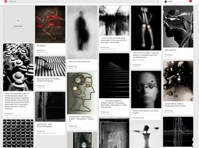
To the right is part of my Abstract photography pinterest where I have pinned what images interest and inspire me. You may click on it to see more.
Abstraction is a form of art and photography which focuses on: shapes, colour, form, pattern and texture. Many abstract images have no instant meaning however when you look into the image, these concepts will sort of shape up the image and suggest to the viewer what the image means. This project's purpose aims to make us gather that there is more meaning to an image than you realise. There is quite a lot of controversy about whether abstract is classed as quite out of the world/surreal or whether it is simply very natural/real.
To the right is part of my Abstract photography pinterest where I have pinned what images interest and inspire me. You may click on it to see more.
Where I intend to go
I aim to have 3 final pieces as a set of similar images in black and white. I would like to display this on a black canvas (which i'll have to paint or spray)
I have various ideas of what I'm going to end with including: lighting a matchstick or incense stick which hasn't lit out, a pile of open books/magazines lying on top of each other and forks on a white background which has a shadow.


Most of these images weren't thought about or planned.
The images that weren't planned seems to come out better than the ones which were planned which sort of goes to show that over-thinking images sometimes isn't always necessary. The two images which I planned were the ones with the two people walking on the stairs. I think I could improve those next time without having the side railings in the way as it sort of ruins the images and maybe not in such a coloured building as it seems to clash with the clothing of the people.
The images that weren't planned seems to come out better than the ones which were planned which sort of goes to show that over-thinking images sometimes isn't always necessary. The two images which I planned were the ones with the two people walking on the stairs. I think I could improve those next time without having the side railings in the way as it sort of ruins the images and maybe not in such a coloured building as it seems to clash with the clothing of the people.
SUCCESSFUL IMAGES


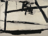
Franz Kline-
Kline enjoyed working with black and white however in this image we can see that white isn't really white.. More a sort of creamy colour. There are many different colours used in this painting so it all just blends together. It seems like Franz has just sort of randomly started painting, not knowing what to do.. Yet still managed to produce something which is quite intriguing.. This could be because the image doesn't really make much sense to the viewer so they would question it even more and be more interested in it. It is said that Kline used to paint during the war to form a new art and maybe even a new world. From the image above, we could infer that he was describing the war as a mess which had no meaning..
Kline enjoyed working with black and white however in this image we can see that white isn't really white.. More a sort of creamy colour. There are many different colours used in this painting so it all just blends together. It seems like Franz has just sort of randomly started painting, not knowing what to do.. Yet still managed to produce something which is quite intriguing.. This could be because the image doesn't really make much sense to the viewer so they would question it even more and be more interested in it. It is said that Kline used to paint during the war to form a new art and maybe even a new world. From the image above, we could infer that he was describing the war as a mess which had no meaning..
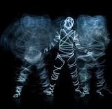
Light - Michael Taylor
There are many different concepts of 'abstract light'. I have looked at the work of Michael Taylor and his work really interests me as he often works with light and humans together. The image to the left is something I'd like to work on and try as it looks quite challenging yet exciting. It seems like there may have been a bit of photoshop involved which is something I'd like to try out on some of my images. I'd also like to try an Dslr camera to do some light painting. I really llove the contrasting on the colours as it makes the figures in the image stand out a lot more.
There are many different concepts of 'abstract light'. I have looked at the work of Michael Taylor and his work really interests me as he often works with light and humans together. The image to the left is something I'd like to work on and try as it looks quite challenging yet exciting. It seems like there may have been a bit of photoshop involved which is something I'd like to try out on some of my images. I'd also like to try an Dslr camera to do some light painting. I really llove the contrasting on the colours as it makes the figures in the image stand out a lot more.
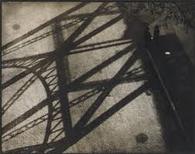
Paul Strand
Strand's work is always well composed and thoroughly thought about. This image particularly interests me as the shadows are extremely fine and have been planned out incredibly. Strand clearly captured the image with interest and a clear vision of how it were to turn out. I really love the contrast of the shadow and it's background. His work is always really soft yet with a crisp quality. The two people standing wearing all black really blend into the ground and they both seem really serious despite not being able to see their faces. Their posture gives off a negative vibe as they're both just facing each other directly with no movement- this was clearly arranged. There are many lines in this image which form the great composition of it all.
Strand's work is always well composed and thoroughly thought about. This image particularly interests me as the shadows are extremely fine and have been planned out incredibly. Strand clearly captured the image with interest and a clear vision of how it were to turn out. I really love the contrast of the shadow and it's background. His work is always really soft yet with a crisp quality. The two people standing wearing all black really blend into the ground and they both seem really serious despite not being able to see their faces. Their posture gives off a negative vibe as they're both just facing each other directly with no movement- this was clearly arranged. There are many lines in this image which form the great composition of it all.
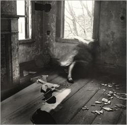
Francesca Woodman
Woodman photo's are really interesting because she always adds a sort of special touch to her images- they're always quite strange in an unacceptable way but somehow she manages to make them acceptable. I really like this image because of the concept of it. The person blending into the walls has been done really well and the general vibe of the image is quite eerie which always adds a buzz to an image. The room seems like to be really poorly taken care of with no essentials in the room and strange mess on the floor which sets the mood of the image- really haunting in a soft way. Francesca mainly took black and white images which, again, adds a buzz to an image, although not always. The tree in the window is really well planned out to give a greater value to the image, in a way which is adds more to the unnatural setting. I find this really interesting how trees are seen as really innocent, natural living things yet Woodman has managed to sort of change this beautiful thing into something which looks quite unearthly. This may even be seen as a contrast between the abnormal room with an extremely strange setting to the beauty of the real world. The different tones of black, white and grey really mix well together with a subtle approach. The different texture used really attracted me to this image as it has made the scenery more dramatic- the really rough wall with no paper on it which clashes to the more smooth wood on the floor.
Woodman photo's are really interesting because she always adds a sort of special touch to her images- they're always quite strange in an unacceptable way but somehow she manages to make them acceptable. I really like this image because of the concept of it. The person blending into the walls has been done really well and the general vibe of the image is quite eerie which always adds a buzz to an image. The room seems like to be really poorly taken care of with no essentials in the room and strange mess on the floor which sets the mood of the image- really haunting in a soft way. Francesca mainly took black and white images which, again, adds a buzz to an image, although not always. The tree in the window is really well planned out to give a greater value to the image, in a way which is adds more to the unnatural setting. I find this really interesting how trees are seen as really innocent, natural living things yet Woodman has managed to sort of change this beautiful thing into something which looks quite unearthly. This may even be seen as a contrast between the abnormal room with an extremely strange setting to the beauty of the real world. The different tones of black, white and grey really mix well together with a subtle approach. The different texture used really attracted me to this image as it has made the scenery more dramatic- the really rough wall with no paper on it which clashes to the more smooth wood on the floor.
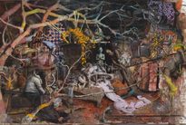
Jonas Burgert
Burgert's work is inspired by human life and what our purpose is.
Each of his paintings have such incredible imagination put into it. He has said ''You present your soul on a tray'' meaning he puts his soul into his work which comes across really strong in his images. At first, this image seems like a bit of a random mess but when you look into it, there's a whole different meaning there.
Knowing what his work is inspired by, we could assume that the monster like things could be the way he sees humans- worryingly scary and vile. This painting is strangely beautiful in a gruesome way. We can see that he has is quite a vivid painter. All of these monsters, demons, children form together to make a dysfunctional family which is really common in real life.
|
|
These images I took weren't great as I didn't really have time to do many photos. My favourite image is probably the candle sparks(9th image). I took this when I was at a birthday party and decided to crop and add an effect to it. I could definitely improve by taking more images and planning it more clearly. Also, my phone was broken which made the process slightly more difficult as I'm usually taking photos from my phone wherever I go. I have focussed on light and tone. In all of these images, I have got a deep contrast in the colours which I really enjoy playing around with as it always seems to make the image a lot more appealing.
|


SUCCESSFUL IMAGES


FINAL PIECE SET


Final evaluation
At first, this topic seemed to be extremely boring as I wasn't aware of all of the elements used in Abstraction. I wasn't too adventurous in the beginning due to lack of confidence, however, as the project went by, I found it a lot more exciting and seemed to have quite good ideas and composition for images. I done a lot of artist research when I first started this project which led me to some creative things.. Soon I started experimenting and refining my images. To improve my images, I would use different apps such as photoshop or flare to edit my images and make them more un-natural. With various different images, I made them black and white to add a more morbid effect.
The formal elements I worked with were light and line- I chose these particular elements as I visualised the kind of effect it could have on my images and decided it would give more of a background to the image.
