CONTRAST
What is Chiaroscuro?
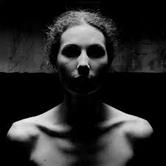
An effect of contrasted light and shadow. This image demonstrates Chiaroscuro perfectly as you can see the many different light shades and dark shades which clearly contrasts. This usually makes the image more bold and strong, making the composition stand out more.
An effect of contrasted light and shadow. This image demonstrates Chiaroscuro perfectly as you can see the many different light shades and dark shades which clearly contrasts. This usually makes the image more bold and strong, making the composition stand out more.
|
Edward Weston Weston worked on a series of images with vegetables including peppers. These aren't just normal peppers, though- they are abstract. The different lighting and angle really makes an impact to the outcome of the image. The use of black&white makes the image look more rich. I think using a pepper for this experiment worked out really well as the images seem so strange yet so familiar. The lines captured in these images makes the photo more bold. |
|


|
Trent Parke Park uses light in an ambitious way to create such an effect on his images. The different tones creative more of an emotion and the use of black&white makes these different shades stand out more. I'd like to incorporate the use of high lighting in some of my own images. The composition is well thought about but in a subtle approach so doesn't look too fake. There are many lines used in his work. In Trent's work, the main focus is usually in the middle which always happens to be extremely whitened. |
|


|
Elliott Erwitt Erwitt's work is very subtle yet crafty. He captures many simple shapes and objects in his photos but are carefully thought out. He photographs from quite strange angles to capture a 'different approach' which could possibly link to his possible different views of the world. |
|


|
Francescca Woodman
Woodman's work is very eccentric as she captures moving life and still life in a very sleek way. The way she contrasts isn't so obvious as the different tones are quite soft. However, the last image is very extravagant with the flash tones. In the second image, she captures movement really well and the use of black and white really enhances this as you can see the moving of the body which clearly stands out from the white wall. |
|


|
Sally Mann
Sally's images are very soft with no harsh tones. This makes her images seem a lot more empty in a way as there isn't so much going on . All of her images include people who seem quite vulnerable and the use of soft black and white tone really makes this stand out. The tones almost make the viewer feel slightly drained themselves as there isn't such a happy atmosphere given off. In the first image, there is a massive contrast between general culture as well as it's not seen as right for young people to be smoking, and stereotypically it's even wrong if a female is doing it as it's seen to be un-feminine yet there's a young girl smoking. The black and white makes this more dramatic |
|


First attempt at images:
My first attempt at contrasting in portraits didn't go quite how I planned. I was hoping to be more distinctive with the tones of black and white which I found was slightly harder than it seemed. Also, it got quite boring as we were just photographing people rather than what was around us.
I did find it exciting experimenting with the lights and changing the brightness to suit the image.
Most of these images had too much light hitting straight onto the person therefore made the whole image quite bright leaving only some areas dark.
The images have a really smooth texture with no harsh shades which was created by artificial light hitting directly onto the person/s.


SUCCESSFUL IMAGES


|
I completely forgot to have a main focus so just captured many random things. The images were taken with direct light hitting the main focus- I just allowed light from my window to come through. This really helped to make the white tones stand out more. To improve, I think I should have thought about a specific theme and be more daring with my images. I think I've definitely grasped how to highlight certain objects within the image to create juxtaposition but I just need more creative things to capture. I took a lot more images but didn't like them so deleted them.. Next time, I will keep my unsuccessful images to show my improvements. |
|


|
Daido Moriyama
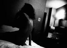
Moriyama is very well known for his explicit images which always have strong emotion in them. I particularly like this image of his because the different tones really compliment each other and form emotion for the viewer. I like that despite the nudity there's still an element of privacy as only her back is exposed and her front is completely blacked out. Generally, nudity and smoking isn't accepted in society but this women seems to be very vulnerable instead of rebellious. The fact that you can't see her face and her body language makes her seem sensitive. There are many lines in this image which form the photo. |
|
|
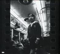
Daido Moriyama
This image has really harsh tones of black and white as the artist hasn't allowed much light to come through which sets quite an eerie feel. There are many lines in this which frames the image more. The boy's legs have been cropped out focussing on what the artist would see as mostly important. The image has a really rough texture I would like to attempt images like his with an eerie setting and harsh tones. |
|


I took these images around school and am quite pleased with the turnout of them. In the majority of these photos, I thought very carefully about the composition however some of them didn't turn out as good as I hoped. I also took them from a range of different angles to ensure it didn't look too bland as a whole set of images. The sun made shadowing very easy to capture.
I found that the first image was the best out of them all as it has great composition and shadows which just really form the image. There's contrast throughout the image, corresponding with each other: the foreground wall with the shadow, the wall with the background, the windows with the background.. etc.
I found that the first image was the best out of them all as it has great composition and shadows which just really form the image. There's contrast throughout the image, corresponding with each other: the foreground wall with the shadow, the wall with the background, the windows with the background.. etc.
SUCCESSFUL IMAGES


These images weren't too carefully thought out therefore the composition isn't as great as it could be.
I've managed to get various different tones in all of these pictures which I'm quite proud of. Having the images in black and white allow the contrast to be more bold and come through more.
The theme for these set of images was mostly line, shape and natural light. Most of these images seemed to have a recurring object in them which was a window, which allowed a lot of natural light to come through.
You can see that it was quite light outside as there's a bold shine in each image.
The texture of these images seems to be quite smooth, there aren't really any harsh tones to give off a rough feel.


All of these photos were taken in Greenwich, Cutty Sark. I took these during the half term as I wanted to get out of my comfort zone and just go out to take random images which I generally don't tend to do. I used an iPhone 5s to capture these and used the filters on the camera to make them black and white. In each image, I really thought about the composition and how to capture my surroundings best. This was the first time I confidently took mages in public which is why they turned out so well as I wasn't scared to do what I wanted to. The contrast in these images are really bold which makes it more effective.
SUCCESSFUL IMAGES


|
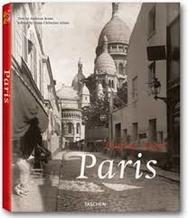
Paris- Eugene Atget
I used this book to refresh my mind of what to capture and found that mine and Eugene's vision was very similar- we seemed to have many images with the same concept and elements. I was inspired by his simplicity yet the way he managed to capture formal elements giving them a really nice subtle fortitude. |
|


I looked back at contrast in portraiture and decided to experiment with natural light and artificial light.
I thought it would be interesting to see how differently the images would turn out and am quite pleased with what I have produced.
In my first image, I really liked the idea of having the candle light as a prop in the image as well as an element in my photography: this allowed there to be more whiter tones around the candle leaving the rest of the image a different tone of grey as well as making the image quite abstract. You can see the absolute black background which makes the person in the image stand out really boldly.
The second image turned out not as expected, but really worked as the face of the person was completely covered by shining a flash light onto his face, and also using flash from the camera which was quite extreme hence leading to his face being completely neglected. I like how the white over powers the tones of black and grey yet these two other tones still really compliment the brightness.
|
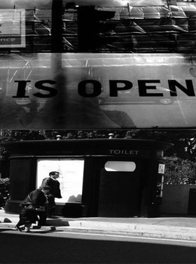
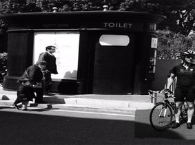
I used photoshop to merge these two images together, however, I didn't get the natural blend I was hoping for. You can see that it's just two separate images put together. Also, the order of the images could have been better- it would look better if I put the bottom image at the top as it could read 'Toilet is open'. I was hoping to be more creative but wasn't too sure how to work photoshop properly.
I will refine this further by changing the order, then blending the images properly and possibly change the gradient to be darker. |
|
|
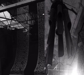
Again, I used photoshop to blend two images together. I think these images went better together though it still looks slightly odd.
These images were taken looking up which made them fit together quite well. To make it look more natural, I should have changed the gradient of the second image to be more darker so it blended more with the first image. |
|
|
This is my third photoshop experiment which didn't go as planned.
The image of the man in the corner doesn't fit with the rest of the photo as the floor is too dark to blend, however you may just think there was no light directing that area which may make it seem more natural. |
|


Inspired by my previous set of images taken in Greenwich Park as well as Tom Hunter, I decided to experiment further with my own interpretation of contrast. I wanted there to be various different aspects of contrast in these images such as: nature and man (which could also be seen as a contrast of old and young), slight abnormality in human creation(hence the horns) compared with the rest of her classic appearance, the boldness of the background compared with her white clothing and lastly, the colour of her hair compared with her clothing.
I really wanted to emphasise the natural light to create an ethereal theme- which is why I chose to take the images in colour rather than black and white as that would take away the elegance of them. Framing a person within the image made the whole ethereal theme come alive in a sense despite humanism being completely the opposite to it. I chose to make the girl look as if she just found pieces of clothing around rather than a well organised high street looking outfit to ensure it doesn't look 'normal'. As well as being contrast images, I wanted them to be slightly abstract too. This was a rather spontaneous idea which really worked for me as I did know exactly what I wanted to do.
Final pieces( 2 sets)


Final Evaluation
The process of this project was thoroughly enjoyable, yet stressful at times. On some occasions, I didn't quite know how to produce what I wanted to, so spent a lot of time doing artist research and looking at various different images which were striking enough to me and inspired me.
This resulted in me being adventurous and trying out things I most probably wouldn't have.
At the start of this project, I wasn't really confident with taking images in public, or at all in fact, but throughout, I did gain more and more confidence as I felt more comfortable with photographing. and enjoyed it more too. I found that the more you enjoy taking photos, the more confident you are with taking photos and producing higher quality images.
To improve the whole project, I would have experimented with more techniques and equipment rather than just using phones and dslr's.
The first photo shoot I did was in school, involving portraiture which was more of just an experiment rather than serious images as I was just getting used to the whole idea of contrast and how to create it. I found that although there was already a natural contrast in the images due to it being in black and white and the fact we used a light, it was difficult to adjust the exposure to fit the image. It became clear that there was too much light on the model's faces, however, I hadn't realised this until after the images were taken. This then gave me an insight of how to take images for future purposes.
I then took three random photos just as for fun(although I now feel like I should have taken more), which actually turned out fairly decent as there was a really bold contrast within the images achieved by decreasing the original exposure and brightness on my phone.
I then took images around school which were also fairly random, however, seemed to turn out well as there was a subtle natural light from the sun which seemed to be hitting all of the areas I took my images.
